Selkie S/S 23 You Are Stunning
 

From Tiktok To The Runway

Regency Renaissance Era meets comfort of Selkie

Photo Credit provided by Selkie


Photo Credit provided by Selkie

I pulled out my phone for directions, running off the subway to the Selkie show venue, only to notice a few others dressed in gorgeous gowns walking around me. It’s hard to miss a Selkie outfit — so I put my phone away and followed the crowd. Almost everyone around me was dressed head to toe in Selkie, I gave my little “soooo where are you going?” as we all obviously walked towards 99 Scott in Brooklyn for the show. And let me tell you — never have I ever attended a show where majority of the audience wore the brand. It was unreal. Everyone truly pulled out their favorite dresses just for the occasion and it was phenomenal to see the power of Selkie. There was an electrifying aura of femininity in the air. True to Selkie’s nature of designing with the female gaze in mind, the crowd of puff dresses and voluminous ruffles gave everything and more.

Mind you, this was all before the show had even started.

Attendees dressed in Selkie — via @fashionablykea

Attendees dressed in Selkie — via @ariannabaq

 
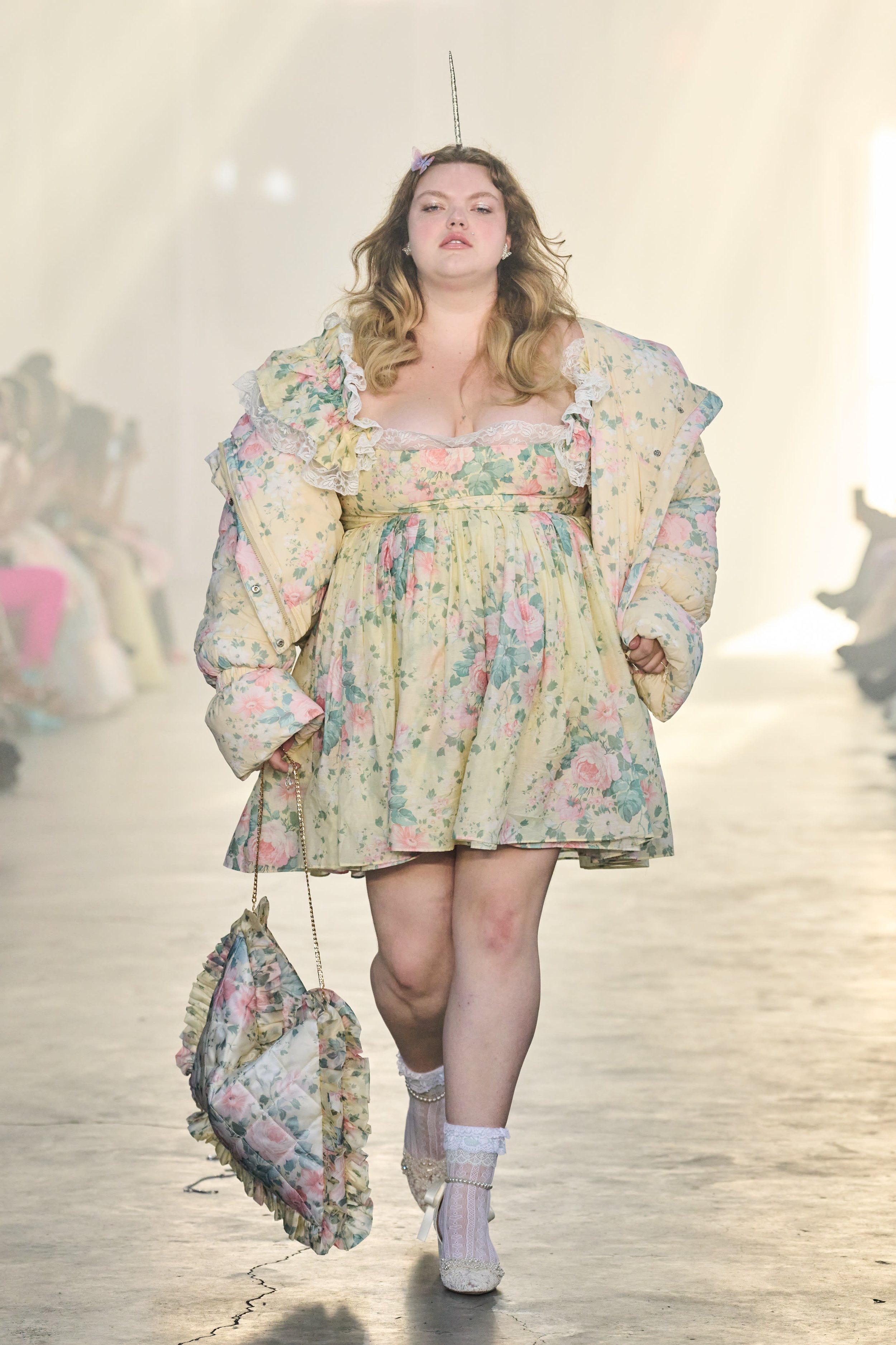
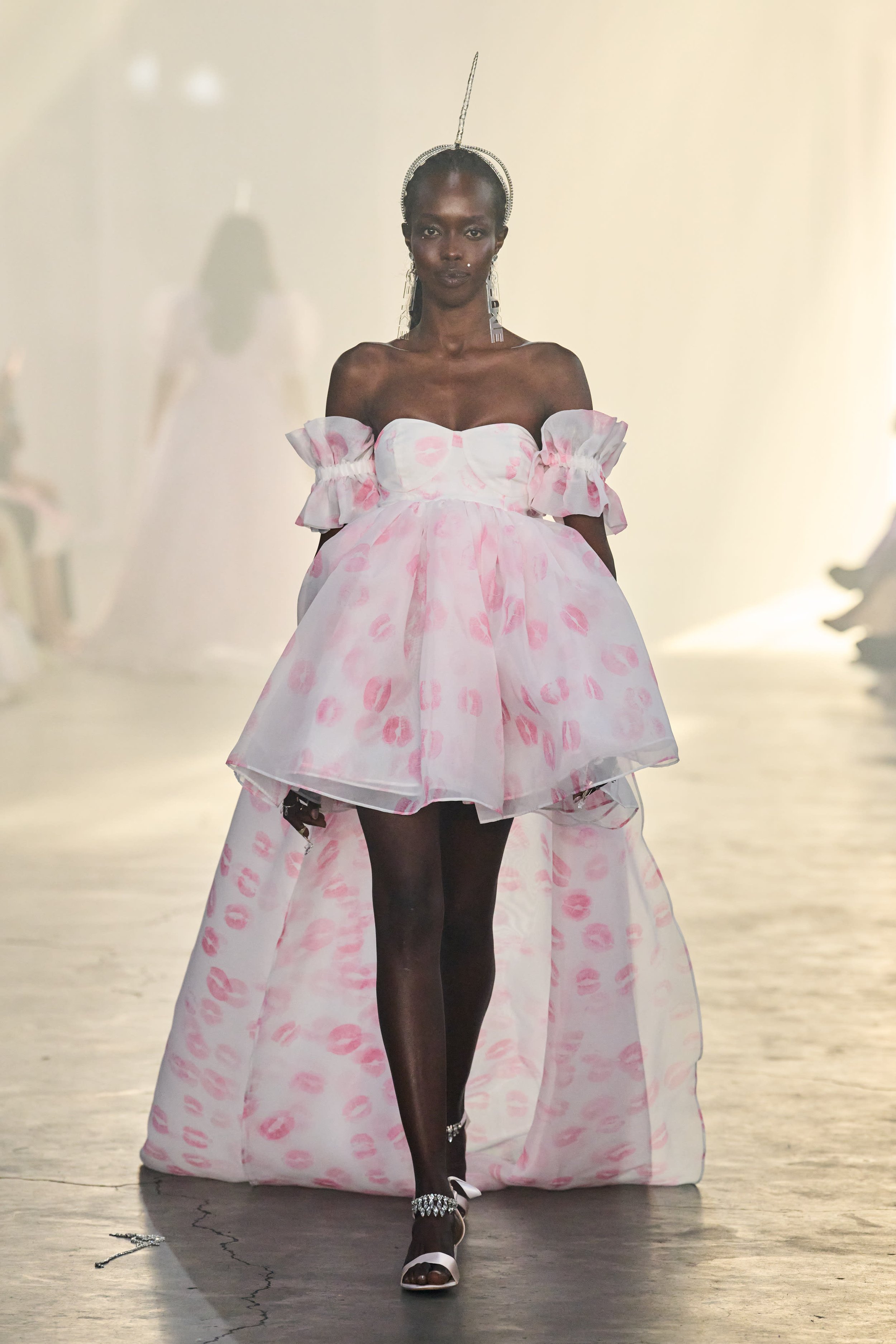
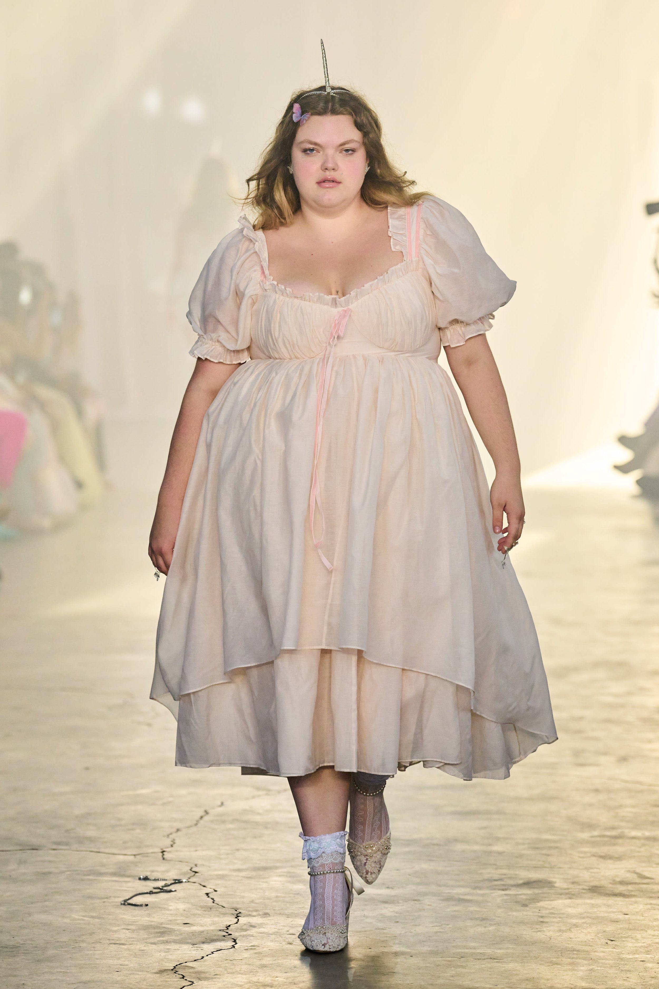
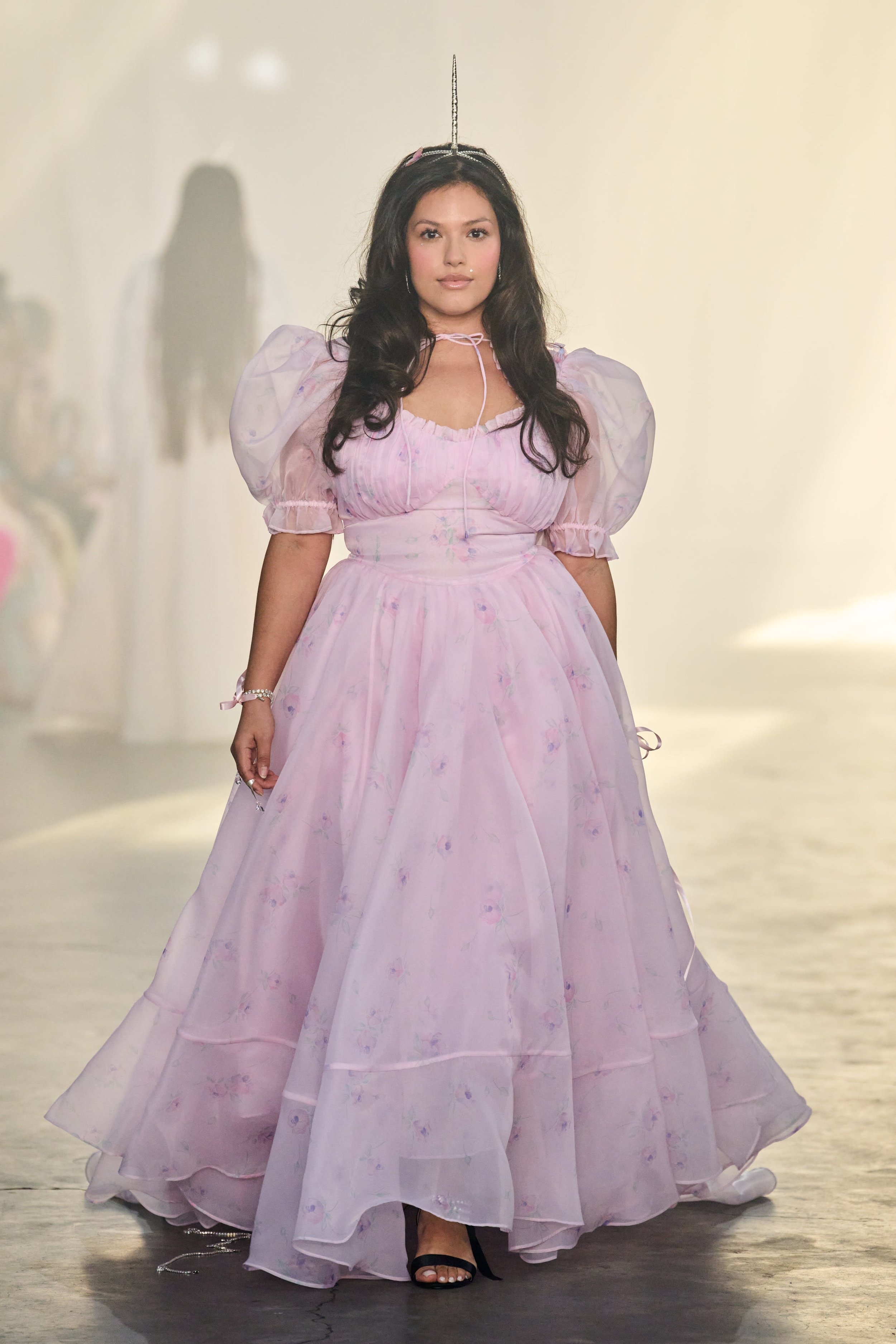
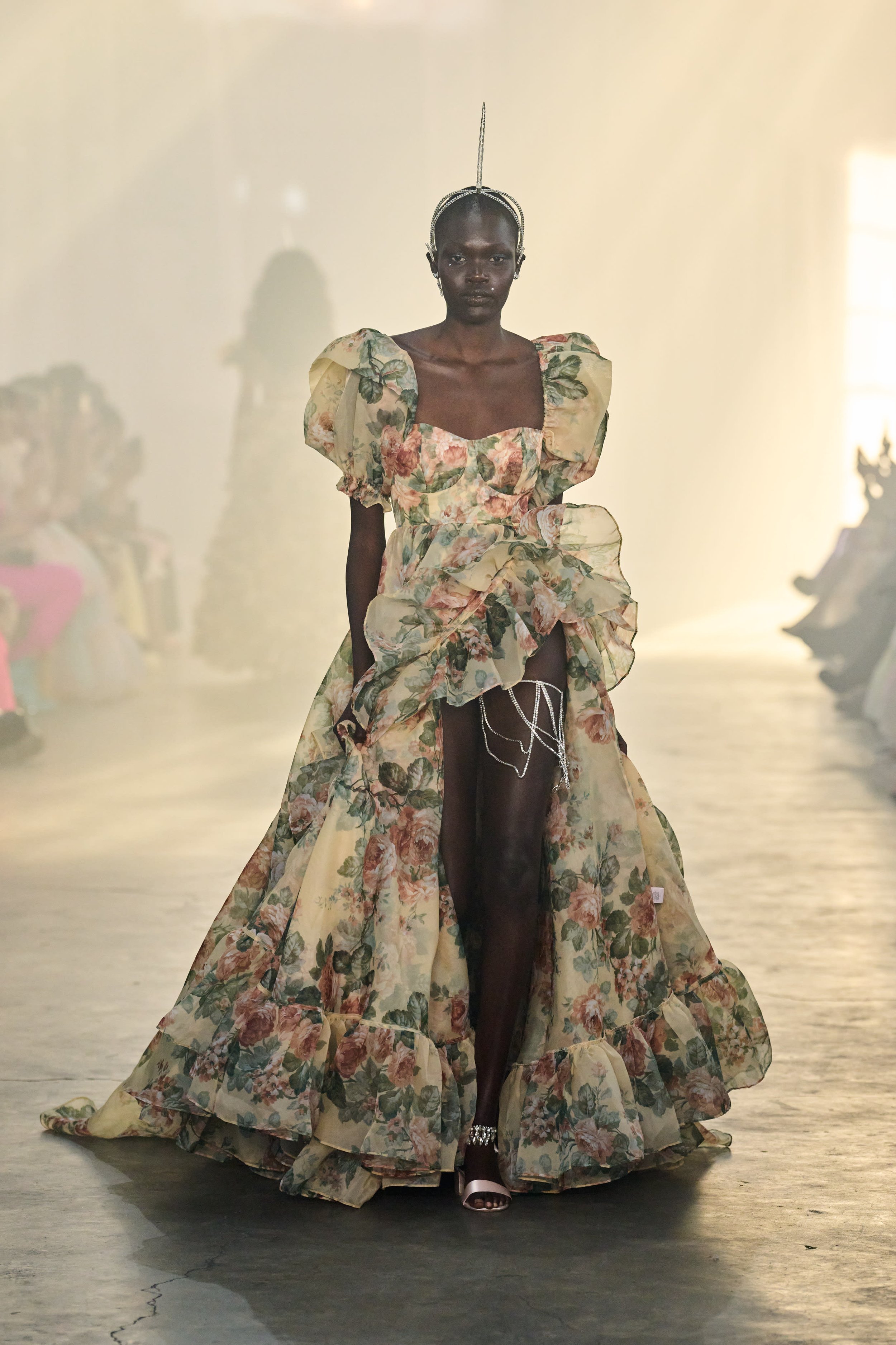
Never one to blend into a crowd, Kimberley Gordon brings her signature princess gowns, ridiculous ruffles and pretty pastels to the runway once again.
— Via Selkie

Attendee @montselewin wearing the newest collection + me

Kimberly Gordon, founder of Selkie, truly set a transcending stage. The Selkie S/S 2023 show somehow managed to combine the industrial-ness of Brooklyn with Selkie girliness. As sheer pink fabric was hung from the windows, light filtered into the concrete box, creating almost a fog, which only added to the whimsicalness of the collection. If you noticed unicorn horns on the models, it’s because Gordon was “inspired by the cult classic story, The Last Unicorn” a movie that depicts an army of unicorns who “unite for an explosion of color as we celebrate the odd girl out”.

 
Inspired by cult classic story, The Last Unicorn, Spring 2023 Selkie reimagines the tale with a more is more approach, plucking nostalgic memories from the turn of the millenium and splashing them across an army of extravagant unicorns, who’ve hidden themselves inside these human bodies for too long. Lost lonely rebels unite for an explosion of color as we celebrate the odd girl out.
— Via Selkie
 

Selkie was truly born with the puff dress we’ve all seen and love on Tiktok and because the brand is so intrinsically feminine and divine, it is hard to replicate its approach. From ruffles to bows to the colors and patterns, the S/S 2023 collection feels like Selkie in its truest form. The floral patterns and pastel colors, like strawberry milk ruffles, brought extra romance to the collection. In a very regency-era meets comfort core kinda way, even the bags were quite literally pillow-like with royal patterns and a gold chain (also I now need a pillow bag in my life).

The runway show was proof that Selkie is by far one of the most size-inclusive shows this season. The audience loved it, as many around me cheered loudly for their plus-sized stunning gals. I respect Gordon’s dedication to pushing Selkie’s inclusivity aspect, while also being the brand we all seem to need right now. After the recent years of the pandemic lockdown and sweatpants era, trends started to shift towards the sparkly dresses and high heels, but there is something nostalgic Selkie brings to the table — our childhood memories of dress-up.

When did it stop being normal to wear our Disney-like princess dresses in public?

I remember feeling so confident in them and I love how Selkie is (in a way) normalizing that again. There is something fun and beautiful about being confident in a gorgeous puffy dress and feeling unapologetically feminine. I could see it in the audience as everyone sat in their dresses (some with butterflies in their hair); they were unapologetically divine, cheering and clapping for the models, fully involved with the show — it is a true testament to the influence of Selkie’s cult.

Each collection tells a story and presents a dreamy world through its imagery — Selkie

 
Nora GharibNYFW, Fashion, Design
The Impact of Color in Interior Design

In the modern world, we spend a lot of time inside. In fact, researchers estimate the average person will be indoors an amazing 87% of his or her life. We are understanding more and more that the environment around us shapes us in a myriad of ways. That means we have good reason to pay careful attention to the design of the spaces in which we spend so much of our time. They can have a powerful effect on us, for good or ill.

One of the aspects of our environment that we have found has an impact upon us is color. It isn’t just an arbitrary matter of personal taste. Instead, color can affect our mood and even our physiology. It also influences our spatial perception of a room.

In this post, we’re going to briefly explore these significant aspects of color as well as give an overview of some key terms to understand when working with color in interior design.

The Psychology of Color

In 1810, the German poet Goethe published Theory of Colors, in which he explored the connections between certain colors and particular emotional states. In the 1900’s, there was an increasing interest in this topic, which attracted both theoretical speculation and empirical research. In the past few decades, color has been increasingly understood to have an effect upon us that goes beyond our aesthetic preferences.

Indeed, there are color receptors in our eyes that have nothing to do with vision, but are instead connected to the part of our brain that regulates our biological functions through the use of hormones.

One example of this we read a lot about lately is the impact of blue light. It helps signal to our body that it is time to be awake and contributes to a state of mental focus.

Another color that has been shown to have a significant impact upon us is red. This stimulating color can even raise a person’s heart rate and make a room seem warmer than it actually is.

In general, warm colors (like red, yellow, and orange) seem to have a stimulating effect on us, improving our mood and giving energy. On the other hand, cool colors (like blue and green), have a calming and focusing effect. These are important things to keep in mind when thinking about what a space will be used for. We want the color to cooperate, so to speak, with what we are trying to achieve. A bright red bedroom, for instance, is probably not a wise choice.

Color and Space

One of the other fascinating aspects of color is the way it can affect our perception of the size of a space. Generally speaking, lighter colors are going to make a room feel more open and spacious. On the other hand, darker colors will have the opposite effect.

This is useful information when it comes to interior design. Sometimes we want a room that is overwhelmingly large to feel smaller, closer, and more intimate. Darker colors can help us achieve this effect. On the other hand, a very small room or tight hallway can be given a more airy and spacious feel with light-colored walls and ceilings.

The Dimensions of Color

Understanding the ways that color can affect us is a helpful starting point. Actually putting this knowledge to use in selecting appropriate colors, however, requires knowing something about how color works.

There are three different terms that help us to talk about the complexity of color: hue, value, and intensity. We’ll describe each briefly.

Hue

This is the name of a particular color. Color, of course, is really electromagnetic radiation in the part of the spectrum that is visible to human eyes. A particular color, or hue, can be defined technically as a particular frequency in the visible spectrum of light. To put it less technically, a hue is a pure color without tint or shade. (But what are tint and shade? Keep reading.)

Value

Value has to do with the lightness or darkness of a hue. Mixing white with a hue will lighten it, given a tint of the hue. Mixing black with a hue will darken it, producing a shade. When a color is mixed with both white and black (in other words, with gray), this is called a tone.

Intensity

Finally, intensity, also called chroma, refers to the relative purity of a color. A pure hue has the highest intensity. Intensity is diminished as we add white, black, or gray to the hue.

Keeping these concepts in mind, we can see that one of the things we need to keep in mind when considering the color of a space is the hue. Hues like blue, for instance, can have a calming effect. One of the other things to consider is the value (which is related to intensity). We can choose darker shades to make a room feel smaller and cozier or lighter tints for a more spacious and clean feel.

Color and Design

Given the impact of color we have explored here, it is no surprise that designers of various kinds are increasingly trying to pay attention to color out of a desire to affect human mood and behavior.

Marketers, for instance, use color to try to shape customers’ perceptions of a company and buying behavior. In internet marketing, to take one example, it has been shown that making buttons red increases the rate at which people click them. In Japan, experiments have been undertaken to use blue light to try to reduce suicides in train stations.

In interior design, those who are responsible for residential, commercial, educational, and other kinds of spaces try to use color as one way to make the environment work better for those who inhabit it.

Nora GharibDesignComment
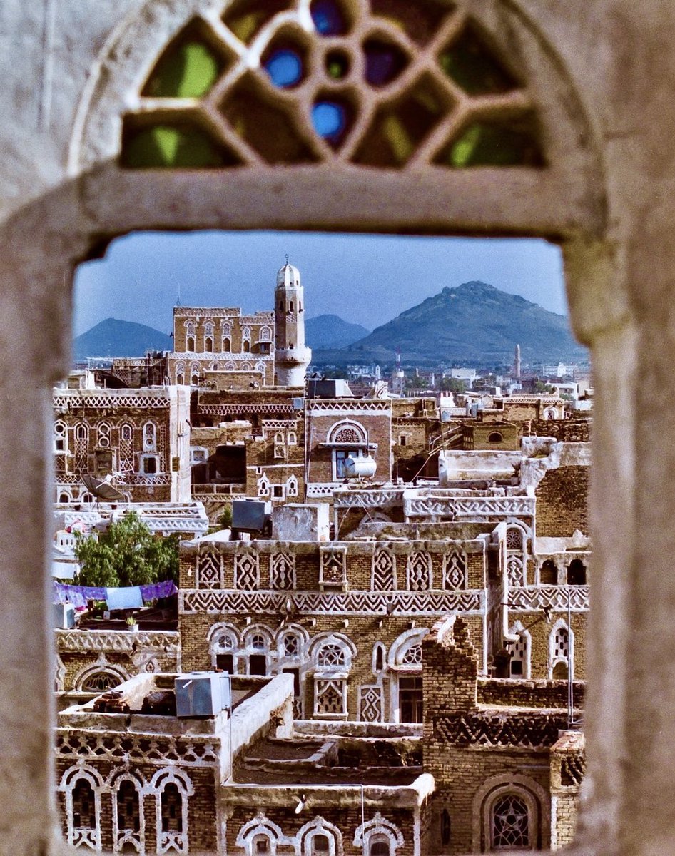
Sana’a, Yemen - A Portal into the Past

Entrance into the Old City Sana’a, Yemen

Sana’a Yemen

“Venice of The Arabia”

What’s the capital of Yemen? Bet you didn’t know it was an ancient city. A hidden gem. Sana’a is one of the oldest cities in the world and continuously inhabited for over 2500 years. Its beauty and history make it one of the greatest treasures in the Arab peninsula.

The exact year the city was established is not on any known record. However, the local Yemeni legend has it that the city was founded one of the sons of Prophet Noah.

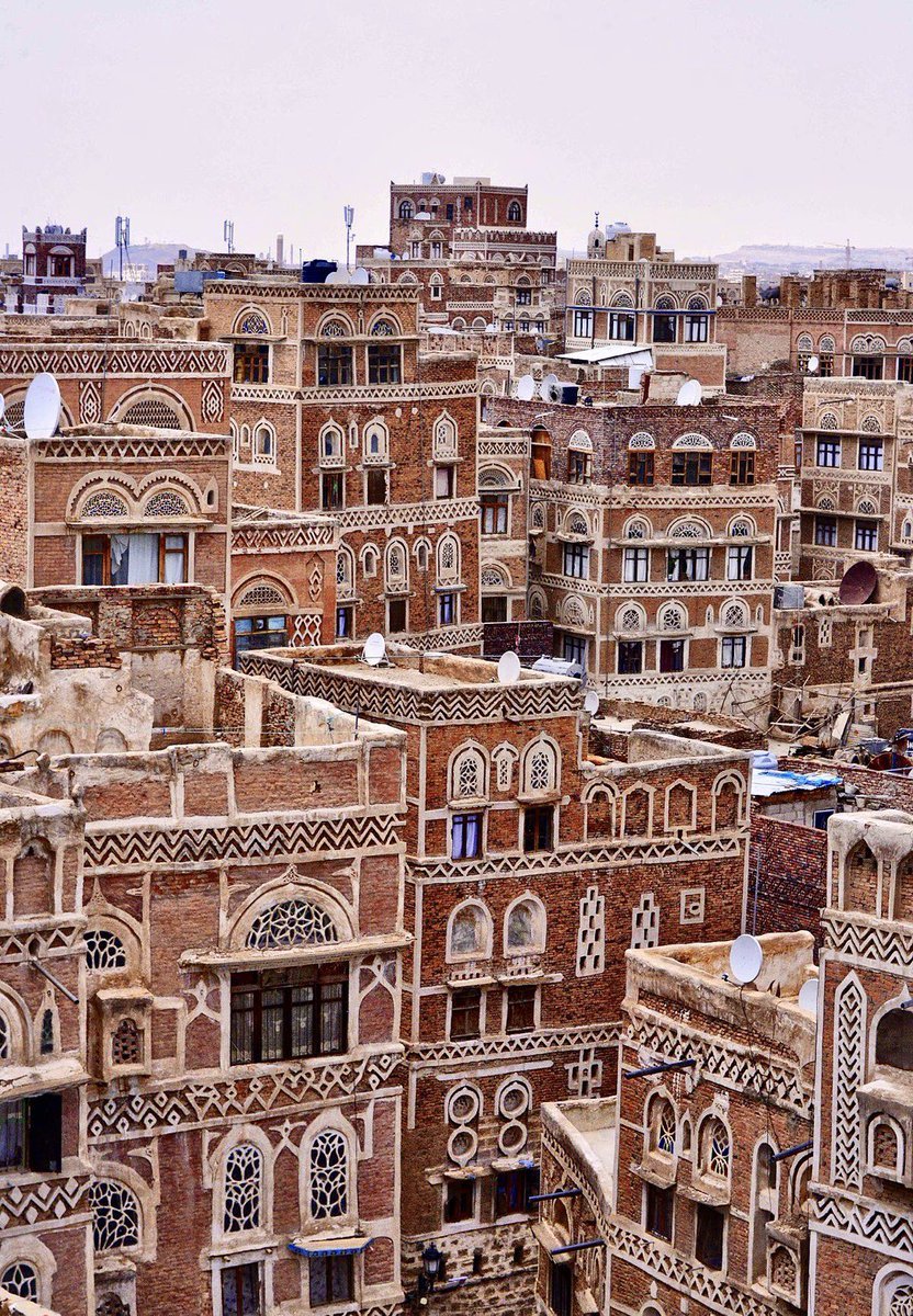
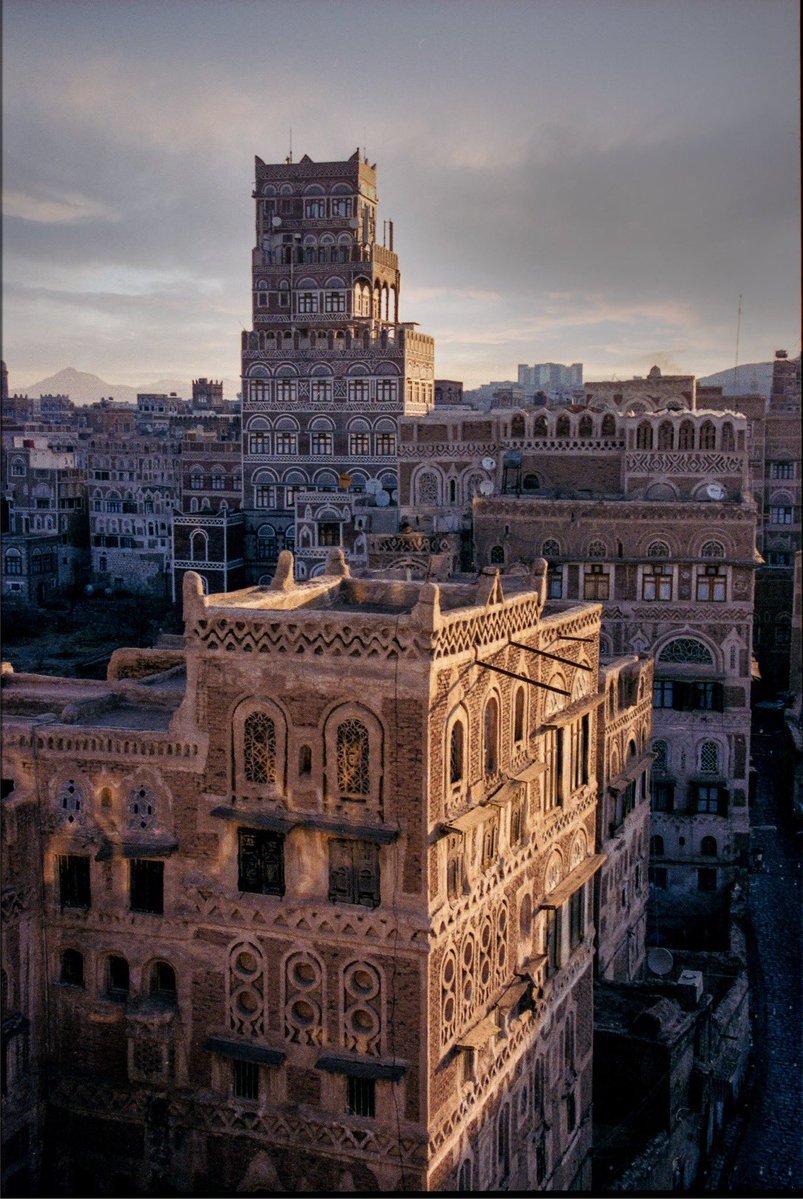
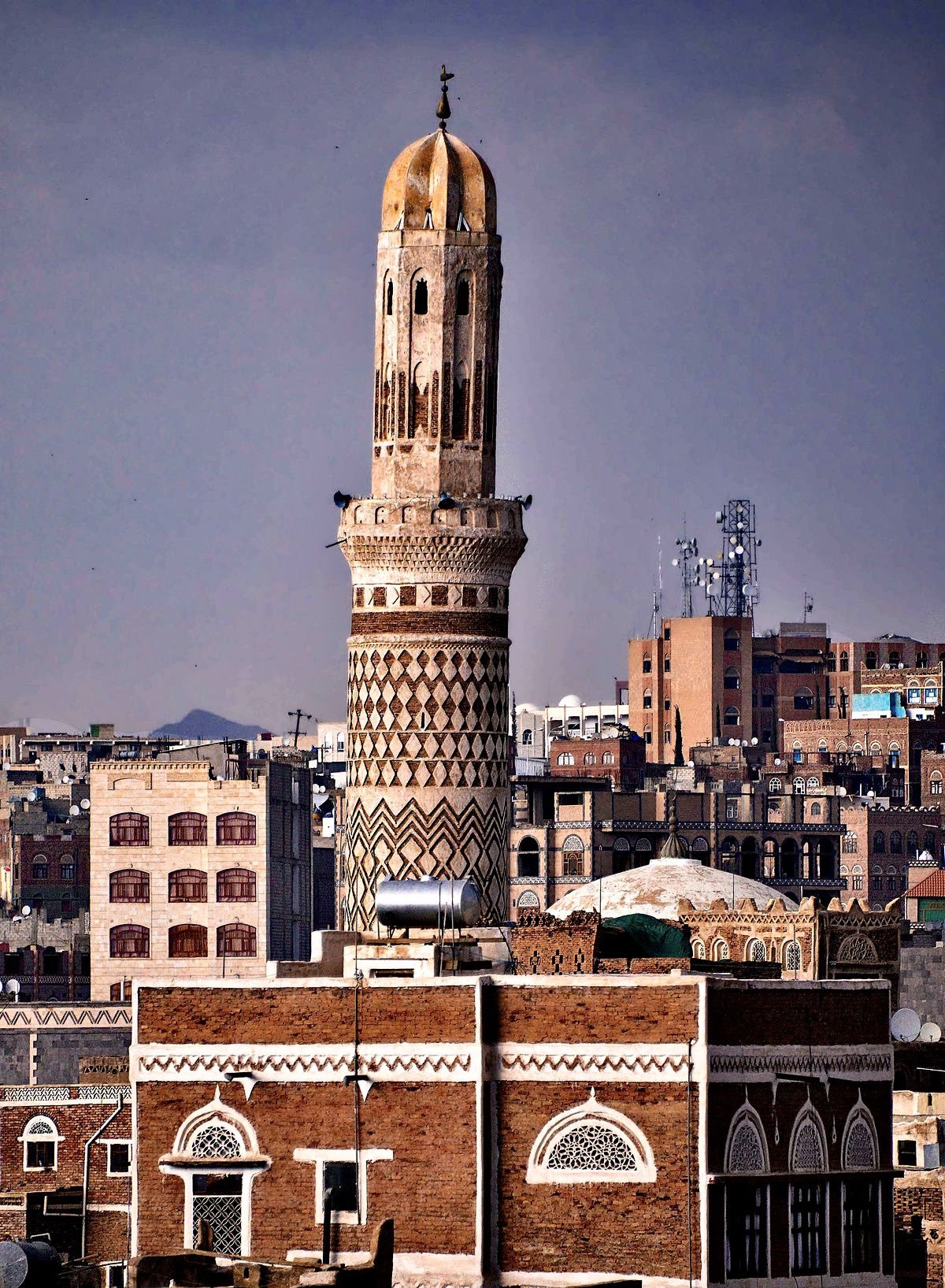
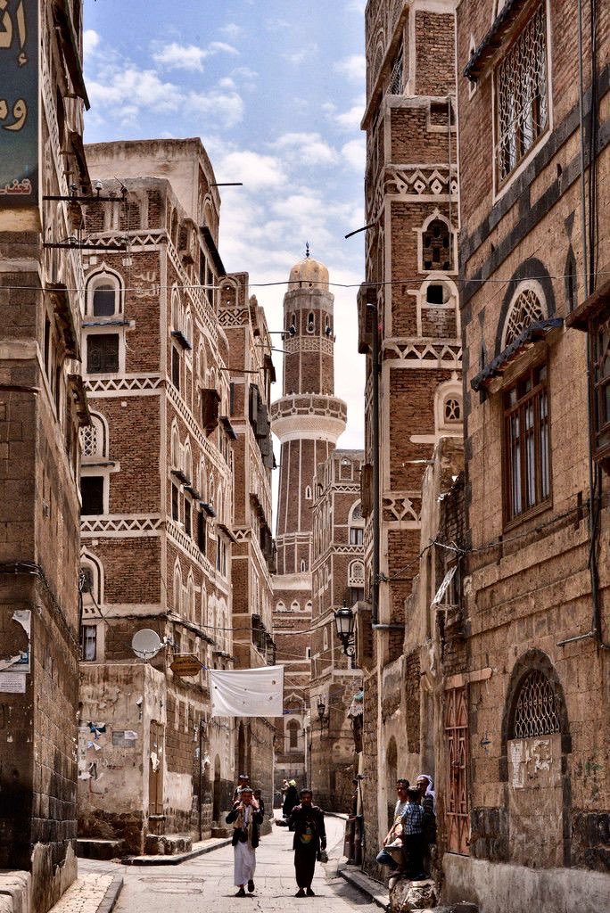
Sana’a was once the central home to the Islamic Caliphate and has continued as the capital of Yemen. There still remains 11 hammams (public bath houses), 107 mosques, and over 6,500 houses. All built before the turn of the 11th century. The city’s elaborate maze of alleys and narrow streets is still functional today - even with modern cars. A remarkable feat for a city that is over 2,500 years old. The city has managed to retain its magical charm and tradition over the centuries and even defying modern architecture today. The city has local gardens (Mqashama) in each neighborhood to ensure self sufficiency and are designed to be watered from the runoff the mosques. The drainage system from other residential and public areas are directed towards the green spaces/urban gardens as well. The environmentally sustainable design built out of necessity is a standard even today’s cities struggle to achieve.

The city has been placed under UNESCO protection at the request of the city in 1988.

The anciet city of Sana’A

The only remaining original gate of Sana’a. One of seven that originally protected the city from invasion. Commonly referred to as the Yemen Gate.

Sana’a is also home to a pre-islamic fortress called Ghumdan. The 20 story palace is thought to be the first skyscraper.

The city is mostly made up of brick houses. The lower levels are built of stone and the upper levels of the lighter brick. The windows are lined with white gypsum.

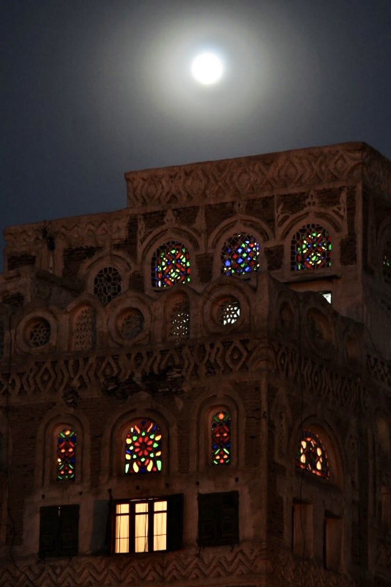
On average, the apartment style homes of Sana’a rise nine stories high. The windows are adorned with stained glass and make for a mesmerizing view, twinkling with light from the residents, in the desert night sky.

Sana’a is also home to one of the oldest mosques in the world: The Great Mosque of San’a (aptly named). Exact date of the construction of the mosque is not known but it is estimated to have been built in 633 A.D.

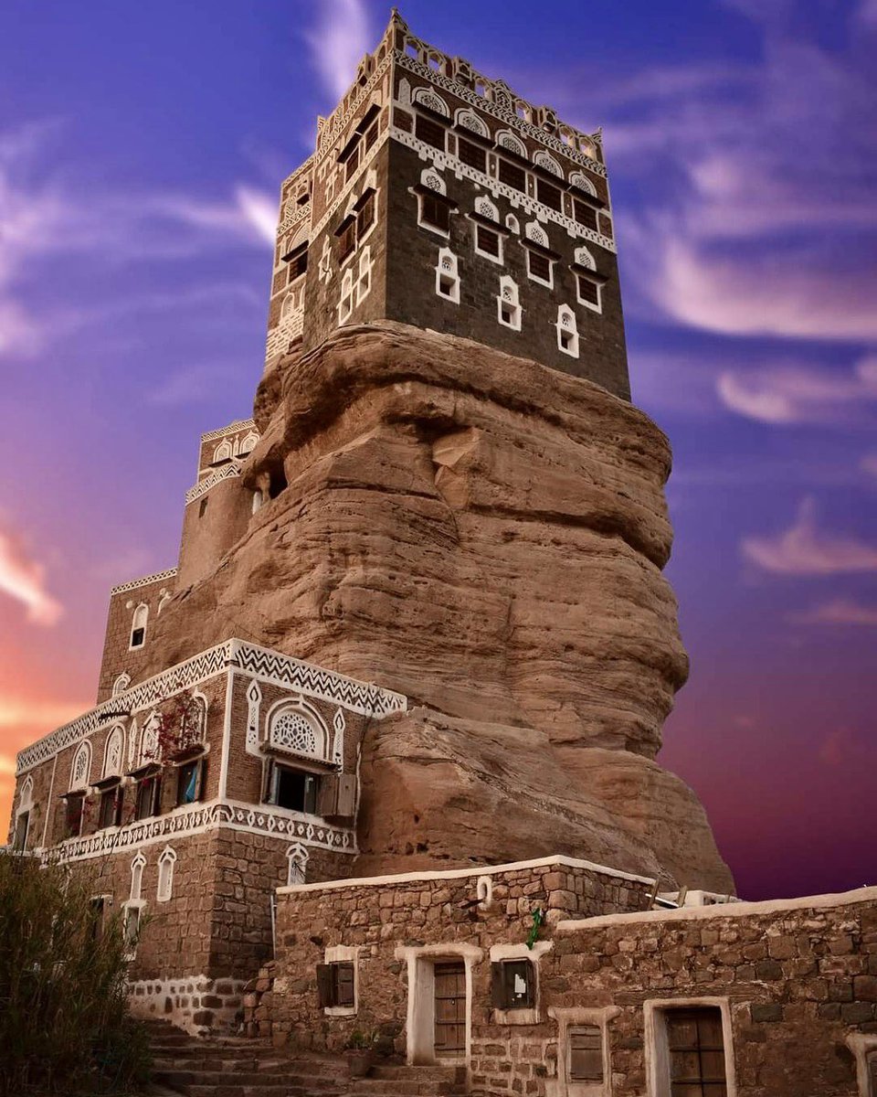
15 kilometers from Sana’a is the Dar Al-Hajar. Although it was built in the 1920’s, the architecture is identical to that of its parent city, 2400 years older. It was built as the summer retreat of the then ruler of Yemen. Of course, right below is a structure built in 1786 for a scholar for his retreat to study, only 150 years before the summer retreat.


Nora GharibDESIGN
NYFW 2022: The Blonds, Hardware LDN, Dur Doux
 

The Blonds

a red, black, white Vixen


The Blonds [Feb 2022]

Inspired by bohemian culture, the collection offered a range of easy silhouettes brimming with a carefree and optimistic spirit.
 

The Blonds [Feb 2022]

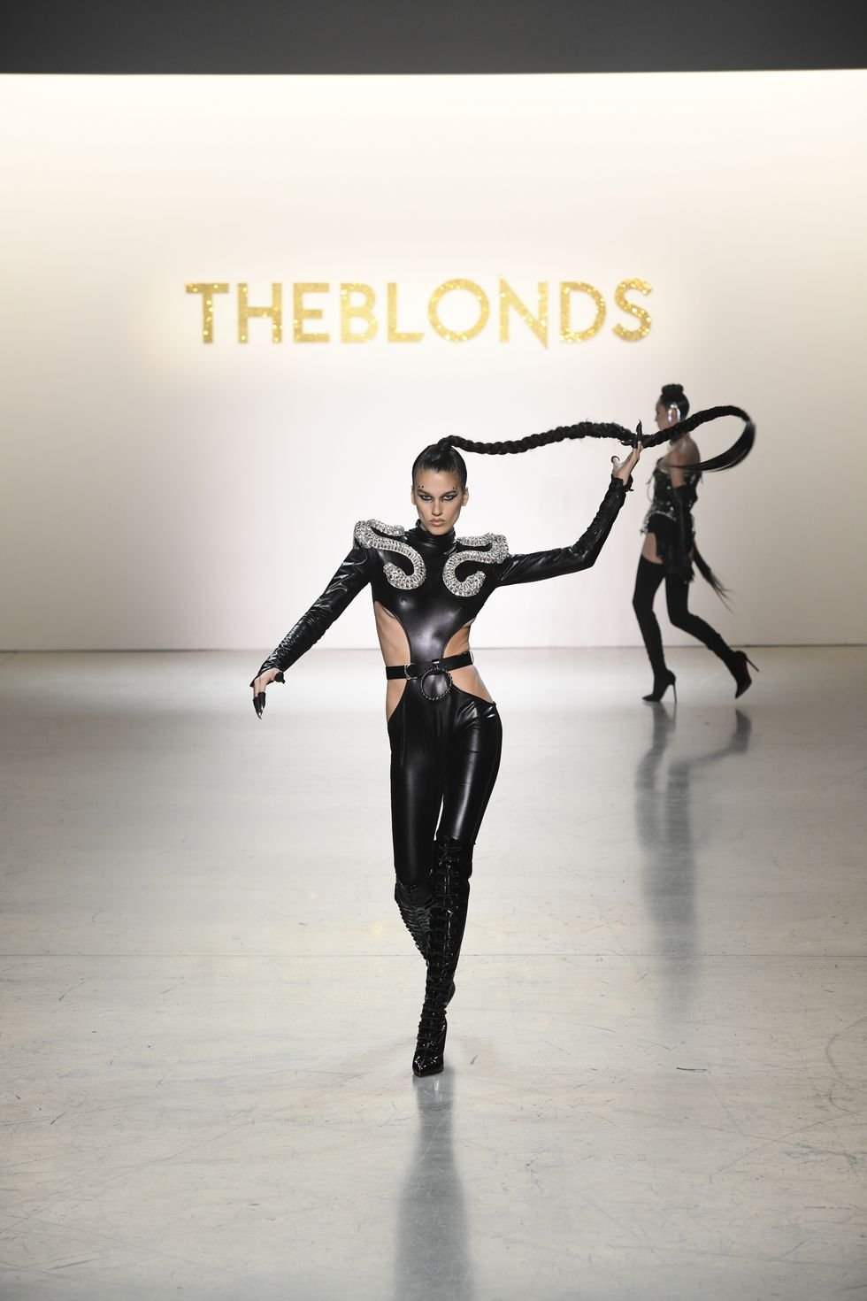
What’s black, white, and red all over? The Blonds! This season I had the pleasure of attending the New York-based brand’s show and it did not disappoint. I walked into the coolest, darkly-lit set-up and sat down, of all people, right next to Phillipe Blond’s auntie (Newyorican tia, as she introduced herself) and Phillipe’s parents. It was such an honor to hear them all speak so highly of Phillipe as we waited for the show to begin. Phillipe Blond opened the show, strutting down the runway— but not before his tia began cheering and applauding, loud enough to hype them up backstage. Phillipe began in a black and white stoned catsuit and matching long jacket. Followed by a series of looks featuring the same pattern in various configurations, the collection was comprised of a series of black, white, and red ensembles,. Then, several of The Blonds’ beloved bedazzled corsets emerged, emblazoned with white and black crystals in large cross motifs, since the brand is primarily known for its over-the-top, glitzy, and fabulous performance wear.
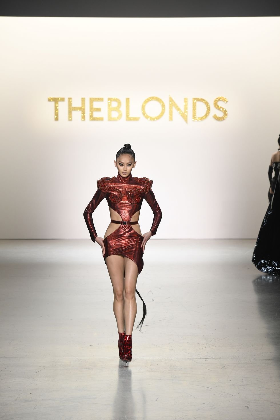
The show performance felt like the Super Bowl Halftime Show, as three dancers performed in a long metallic cape with a bold red lining and sharp shoulders, which was paired with a studded black thong, as well as a sleek and relatively simple shimmering red bodysuit with prominent shoulder pads. The Blonds definitely closed it with a bang, as three models strutted down in three bodysuits in red, white, and black. Far from simple, these bodysuits were adorned with oversized plumes of tulle on the shoulders, hips. They were each paired with a color-corresponding tulle headpiece and thigh-high, high-heel leather boots. It gave us the drama, it gave volume — It seems as though the designing duo is actively playing and experimenting with new fabrics to take their dramatic vision to the next level.

The consistent use of colors gave the collection cohesiveness, yet still delivered all of the fabulousness that one would expect from the brand through their ample use of rhinestones and outrageous silhouettes. I’m definitely excited to see some of these pieces look iconic on the performer’s who wear them up on stage!


Hardware LDN

mixing harsh metal fixtures with feminine silhouettes


Hardware LDN [Feb 2022]

It juxtaposes the softness of femininity with masculine details and creates a collection that’ll make you feel sexy and strong.
 

Hardware LDN [Feb 2022]

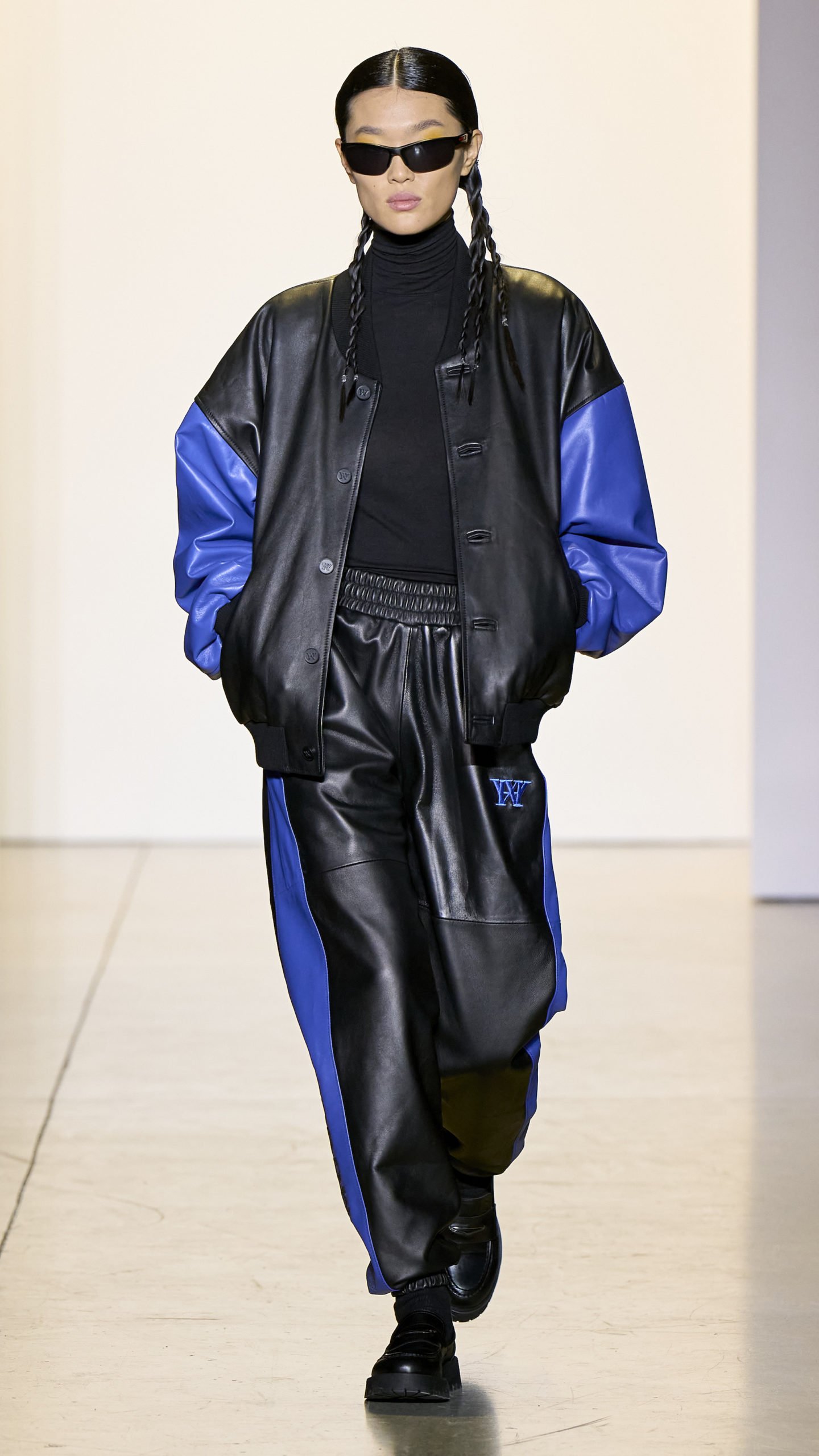
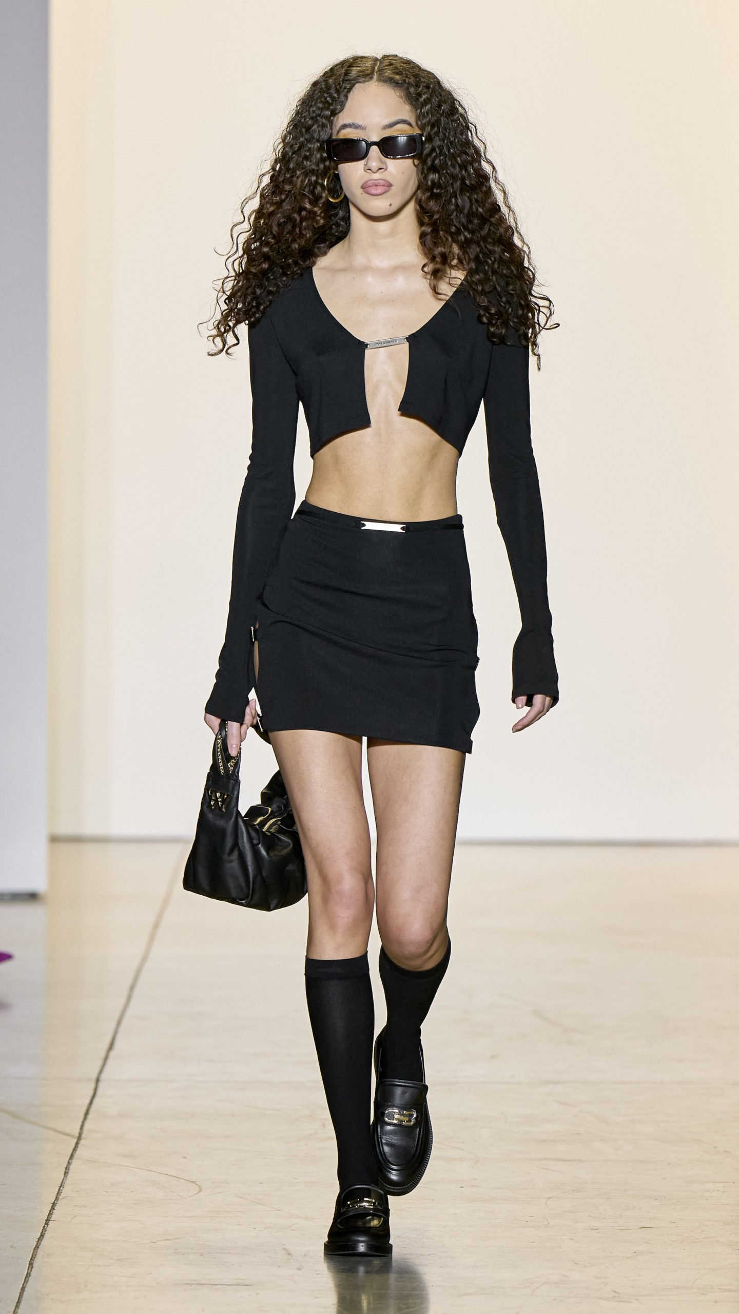
I started out the 2022 NYFW season with Hardware LDN and it gave the perfect “Edgy It Girl” moments. The collection features a variety of form-fitting dresses with suggestive cutouts, held together by thin metal bars. A miss of big leather trenches, baggy leather pants, and tiny leather dresses that hug the body. Paired with sheer knee socks, chunky loafers, and sleek rectangular sunglasses, these outfits are sure to find their way into the upcoming fall/winter cool girl outfits. It felt like outfits Trinity from The Matrix would wear (the ultimate cool girl of 2000s).

What created an interesting twist was the playful addition of color that brightened some of the ensembles. Pops of neon orange fur trim on leather trenches, pink tinted snakeskin, and blue stripes on black bomber sets. While the majority of the collection consists of monochromatic leather or knitted looks, the snakeskin is a must have. Horwell shows a pink snakeskin fur-trimmed trench that is absolutely to die for. It commands the attention of whoever is watching it, and would serve as an amazing outfit of any season.

Hardware LDN combines metal detailing to their womenswear to create a powerful collection. It juxtaposes the softness of femininity with masculine details and creates a collection that’ll make you feel sexy and strong.


Dur Doux

form mosaic art

Bold, statement-making evening gowns and party dresses with a global feel, finding inspiration in Africa, India, and beyond.


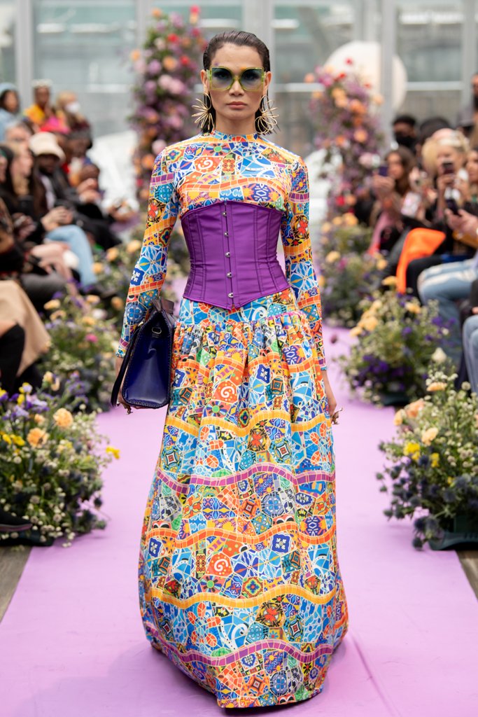
The Dur Doux “La Nouvelle Mosaïque” collection at NYFW was set in Bryant Park and it was the ultimate snow globe princess moment. As the snow flurried outside, inside we were transported to the most colorful, vibrant, mosaic of art. The collection was an exquisite composition of dresses, skirts, tops and sweaters, pants, outerwear, and evening wear in designs that mimic abstract forms and objects and irregular pieces of colored stone, glass, and ceramics. It was a pleasant surprise to see the menswear presented alongside Dur Doux’s womenswear.

The collection is a contemporary fashion interpretation of an ancient popular form mosaic art; their signature is unique textured fabrications, unexpected details, and strong but feminine designs. Very similar to the previous season, the color palette for the collection is exceptionally vibrant with focal colors of very peri, tyrian purple, goldenrod, cobalt blue, and jungle green.

Founded by the mother-daughter duo, Cynthia and Najla Burt, the label specializes in bold, statement-making evening gowns and party dresses with a global feel, finding inspiration in Africa, India, and beyond. As both designers, mother and daughter, emerged at the end of the show — they wept and hugged the audience, which made me realize how much family I was sitting among. It was a heartwarming end to a beautiful collection.

Nora GharibNYFW, Fashion, Design